Rhizoscope provides the strategic design and fundraising expertise needed to turn systemic complexity into actionable, funded projects that restore our urban and rural ecosystems.
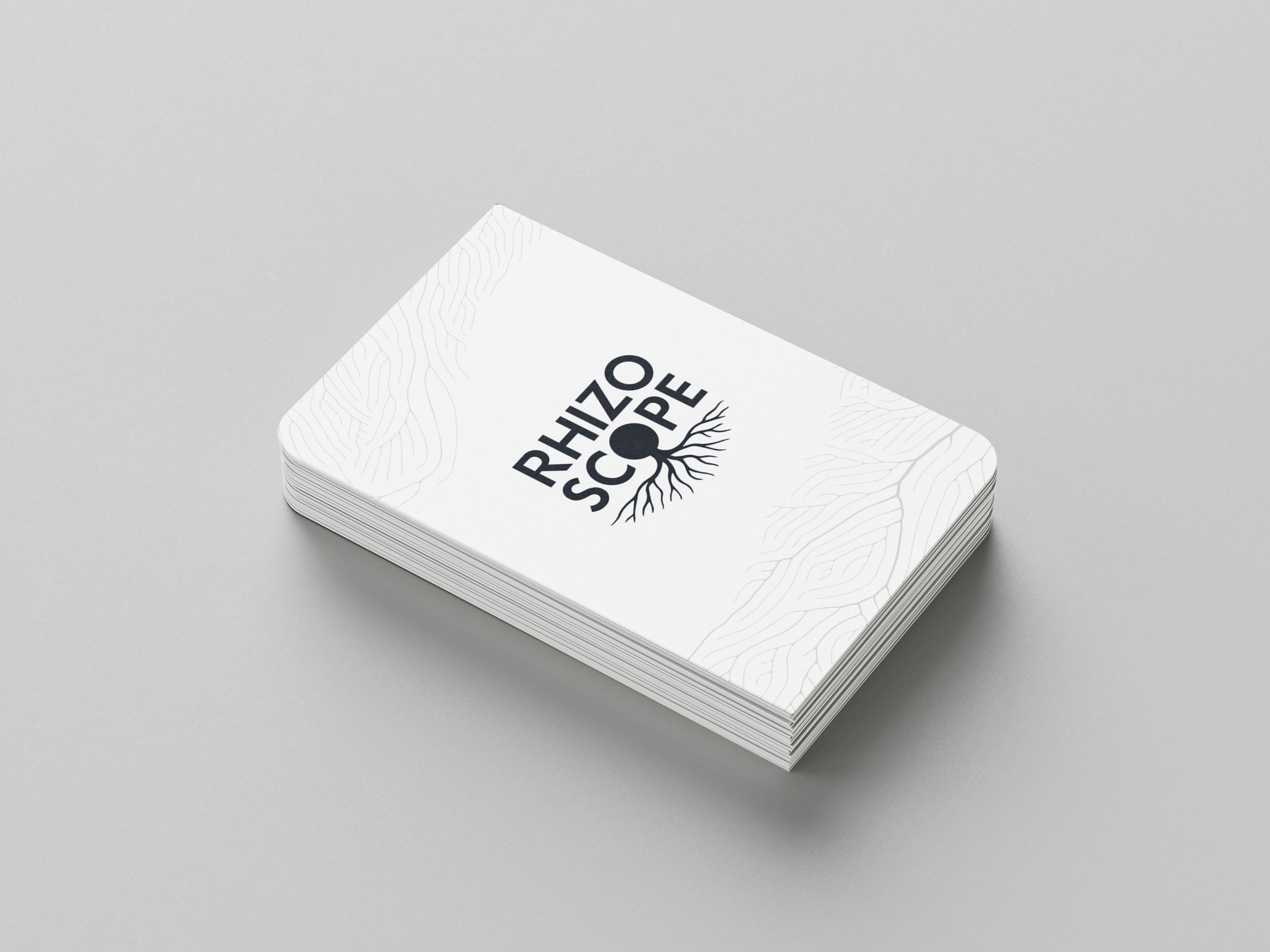
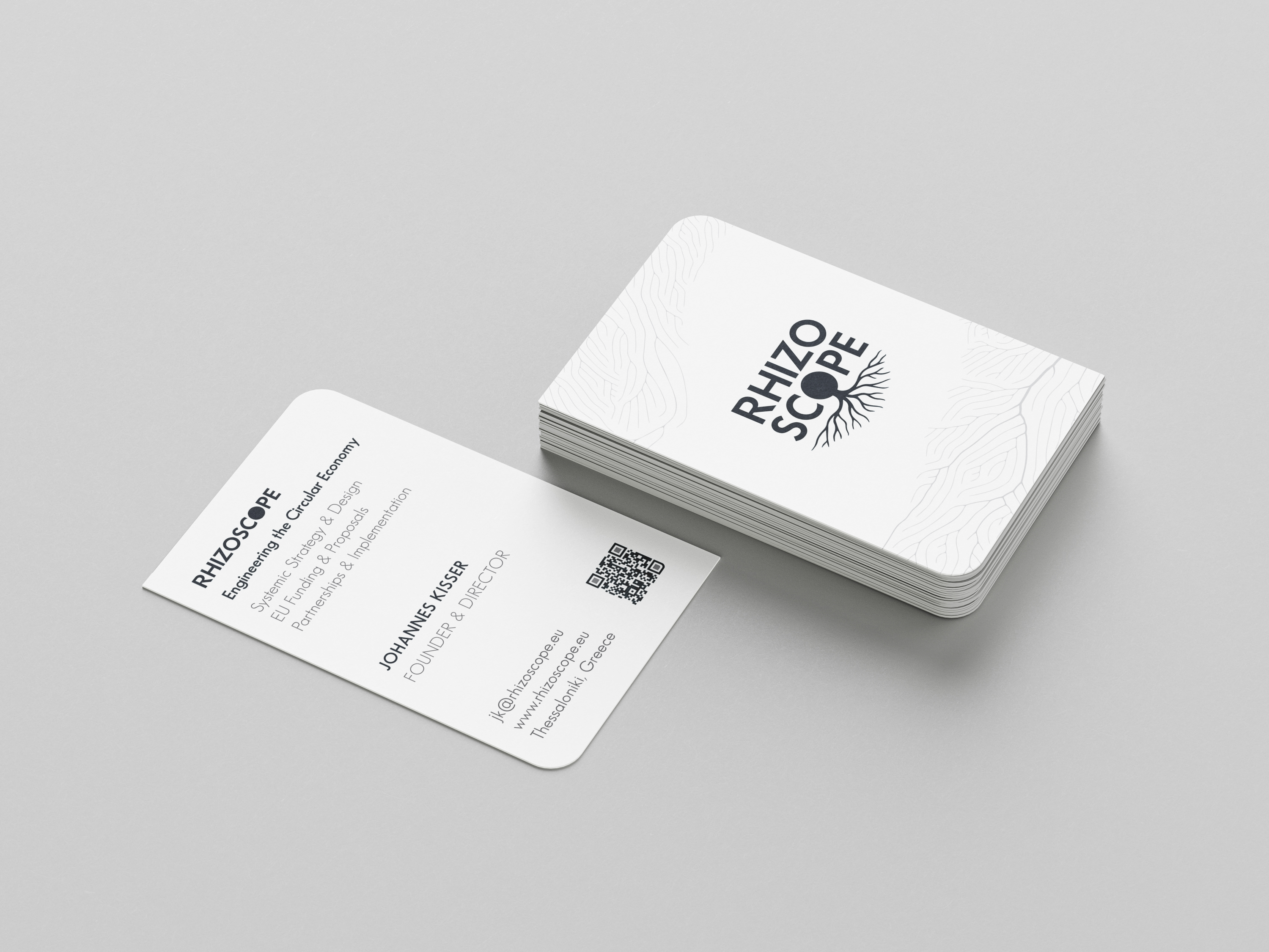
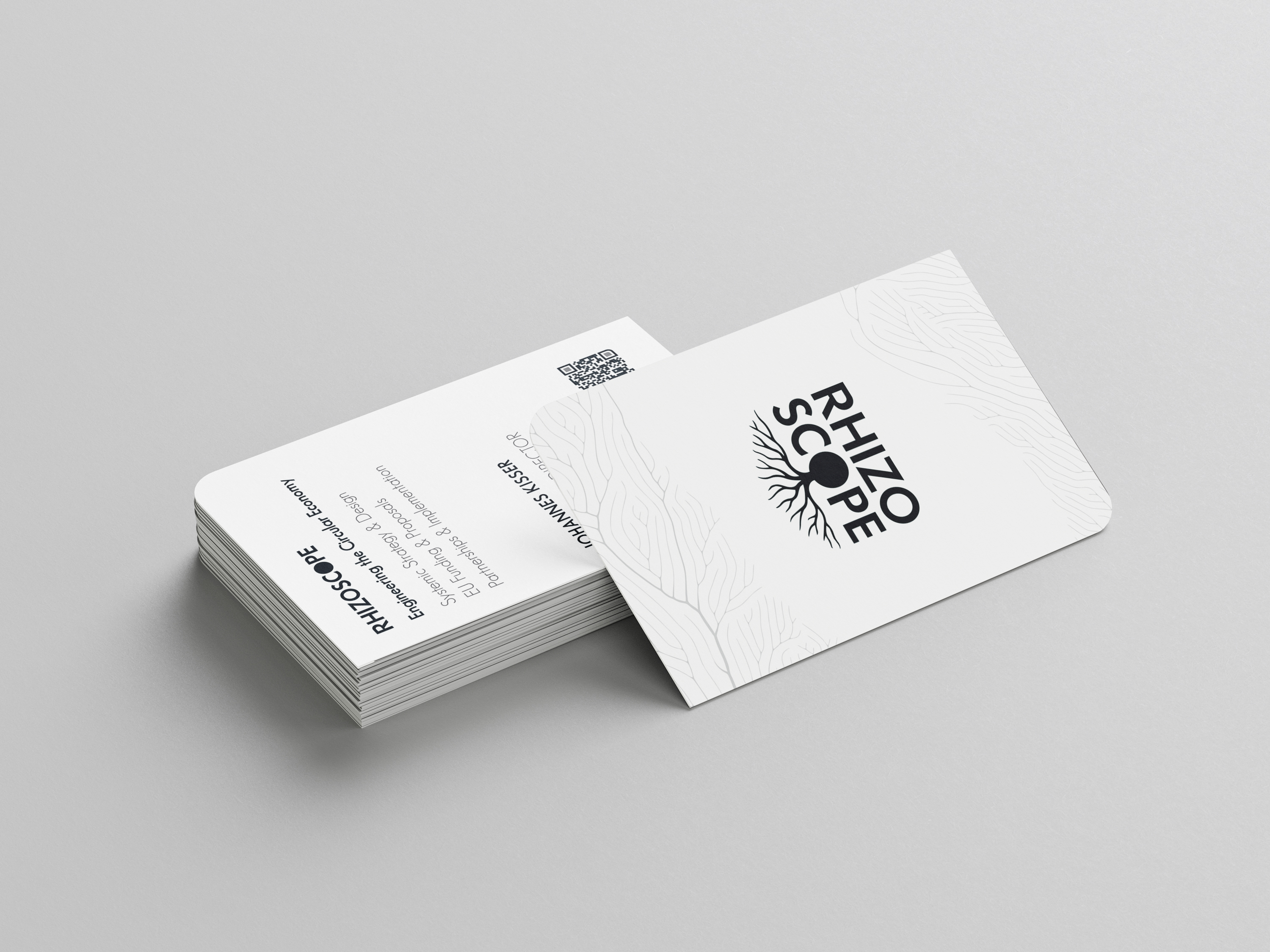
Our work for Rhizoscope included the development of its brand identity, business cards, and responsive website, creating a consistent visual language across print and digital applications. The logo is based on the meaning of the company’s name: “Rhizo” comes from the Greek word rhiza, meaning root, represented by the organic root system extending from the typography. Within the word “scope”, the letter “O” becomes a circle, referring to the company’s focus on the circular economy.
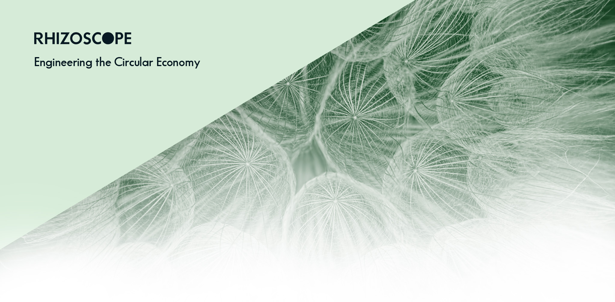
This visual identity was carried through to the business cards and website. A soft green palette, botanical imagery, spacious layouts, and a clear content structure create a calm and approachable digital experience. The website guides visitors through Rhizoscope’s approach, services, track record, frequently asked questions, and contact information, while maintaining a consistent connection with the brand’s visual identity.